How to Make Black and Gold Business Cards Look Premium
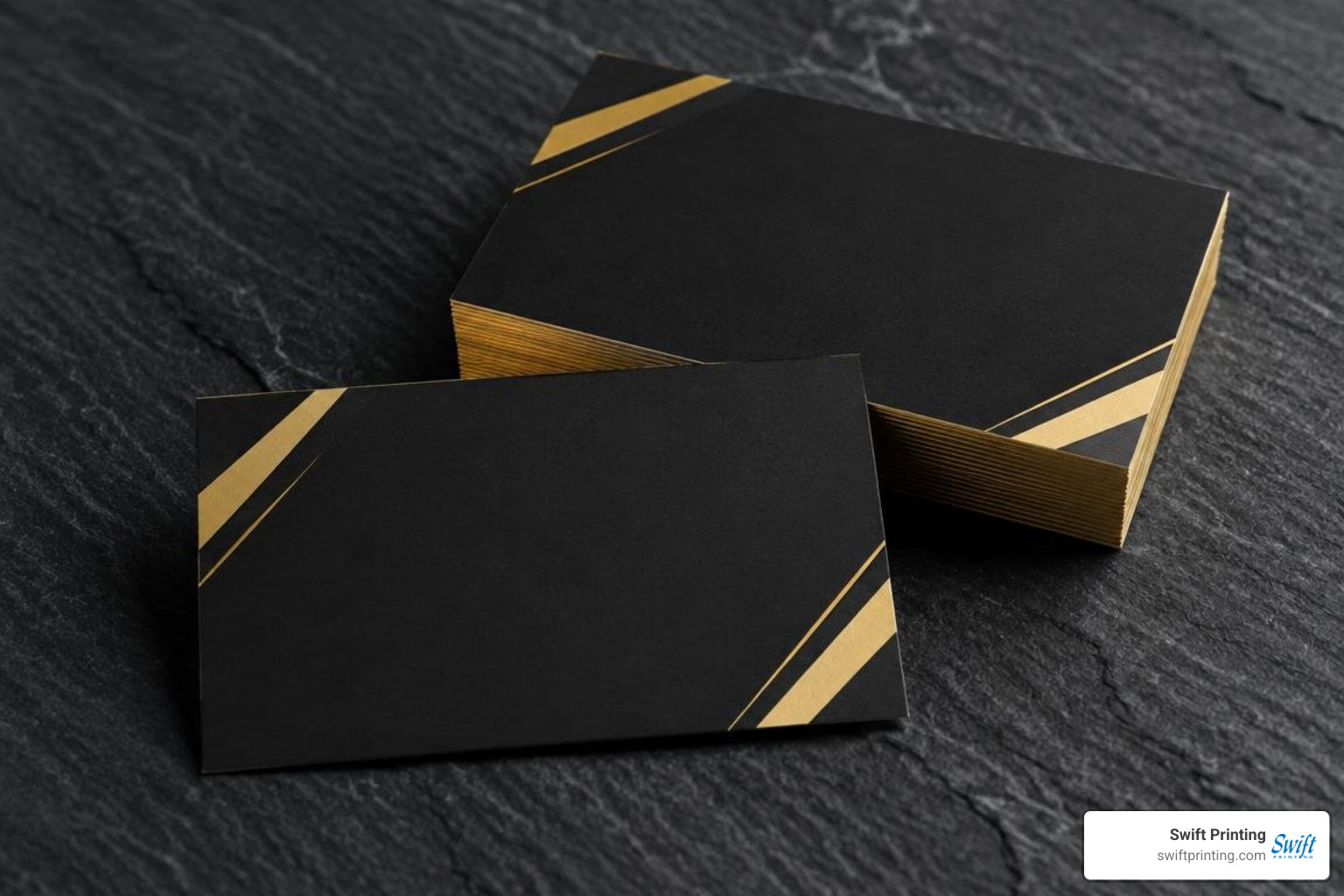
For black and gold business cards that look polished and read clearly, start with a sturdy matte black stock. Use gold foil for the logo or name, then give contact details plenty of space. Before ordering, ask for a proof: printed gold and real foil can look very different.
This approach works well for a law firm, consultant, or other business that wants an elegant card without crowding it with effects. The right finish depends on how many cards you need and where people will use them.
I'm Jessica Gutowski-Slaydon, and I help customers choose paper, printing methods, and finishes at Swift Printing. We're a high-end print shop setting the standard for boutique business printing, and this guide will help you make those same choices for black and gold business cards.
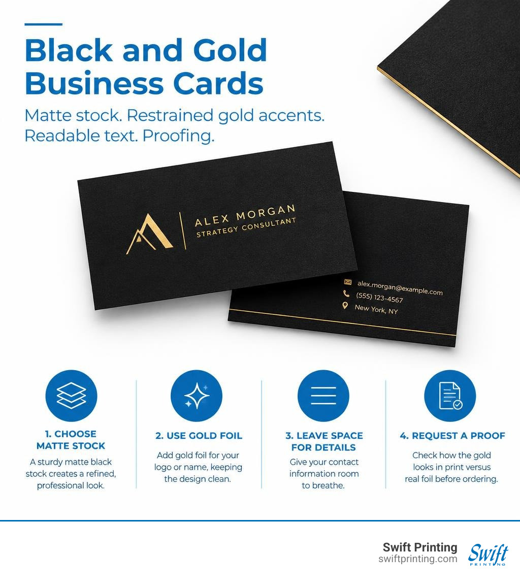
Why Black and Gold Business Cards Command Authority
First impressions happen in fractions of a second. Handing someone a card with a rich obsidian background paired with radiant metallic detailing instantly signals confidence, permanence, and prestige. In an era saturated with digital notifications, tangible touchpoints carry unprecedented weight. Discover in a digital age why you still need business cards to anchor client relationships and establish an unforgettable executive presence.
The visual contrast between deep, light-absorbing charcoal tones and lustrous, light-reflecting precious metals creates an immediate focal hierarchy. This high-contrast pairing commands attention while maintaining impeccable decorum, making it the ultimate calling card for established professionals who let their reputation speak for itself. According to the Printing Industries of America, specialty finishing techniques such as foil stamping consistently rank among the most effective ways to elevate perceived brand value in print marketing.
Brand Psychology Behind Black and Gold Business Cards
Black is psychologically associated with authority, sophistication, discipline, and timeless power. It acts as an anchor, stripping away visual clutter and presenting a slate of uncompromising refinement. Gold, conversely, speaks to excellence, prosperity, warmth, and enduring value.
When you unite these elements, you capture a sense of refined exclusivity. Gold foil highlights catch natural lighting as the card tilts in a recipient's hand, creating an interactive visual reward. This psychological interplay transforms your card from simple stationery into a tactile emblem of your organization's caliber.
Industry Applications: From Law Firms to Executive Suites
While bold, dark colorways can enhance nearly any luxury enterprise, certain professional sectors benefit immensely from this design aesthetic:
- Legal Practices and Senior Partners: Conveys tradition, confidentiality, and institutional authority.
- Boutique Financial Advisors and Wealth Management: Signals stability, high-value asset stewardship, and prosperity.
- Specialty Medical and Surgical Clinics: Establishes world-class quality and cutting-edge care.
- Management Consultants and Executive Coaches: Demonstrates elite corporate positioning and decisive strategy.
- High-End Hospitality and Architecture: Sets an aesthetic benchmark for discernment and bespoke service.
Exploring creative business cards across these distinct disciplines shows how deliberate color selection elevates brand distinction in competitive markets.
Premium Materials and Finishes for Dark Color Schemes
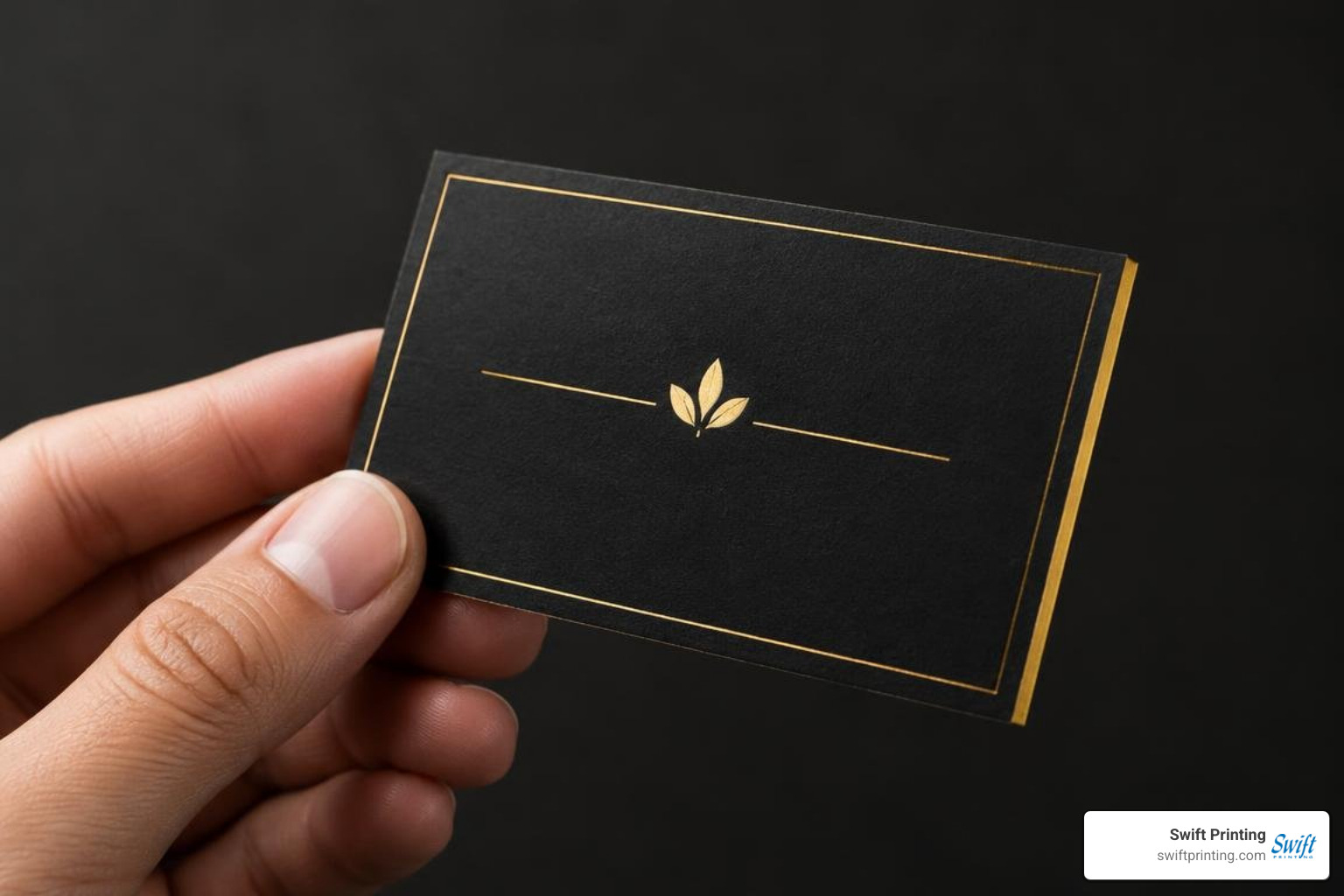
A dark card is only as striking as the substrate it is pressed upon. Achieving a smooth, deep finish requires deliberate paper choices and tailored tactile treatments. When we look behind the print crafting the perfect business card, every variable—from surface texture to core density—dictates the final tactile resonance.
| Material / Finish | Typical Thickness | Tactile Feel | Key Visual Benefit | Best Application |
|---|---|---|---|---|
| Soft-Touch Matte Heavy Cover | 18pt – 24pt | Velvety, smooth, zero-glare | Eliminates finger smudges; enhances foil contrast | Corporate executives, consultants |
| Triplex Multi-Layer Board | 38pt+ | Substantial, rigid, architectural | Distinctive colored center core; ultra-thick profile | Law partners, boutique founders |
| Gold Edge Gilding / Painting | Applicable to 22pt+ | Crisp, beveled, smooth perimeter | Shimmers when stacked or held edge-on | Luxury services, private wealth |
| Anodized Matte Black Metal | 0.5mm – 0.8mm | Cool, dense, rigid aluminum | Industrial luxury, complete durability | Tech leaders, venture capital |
Paper Stocks, Triplex Layering, and Painted Edges
Standard, flimsy cardstocks can detract from dark designs. To maintain structural integrity and prevent ink cracking along edges, premium heavyweights are essential:
- Dense Colored Stocks: Rather than flooding white paper with heavy black ink, starting with an uncoated or silk stock dyed black during manufacturing ensures rich, fade-free color straight through the core.
- Triplex Layering: This technique sandwiches an accent sheet (such as metallic gold or contrasting paper) between two ultra-heavy black exterior boards. The resulting 38pt cardstock provides an unmistakable hand feel.
- Painted and Gilded Edges: Adding a hand-applied metallic finish turns the perimeter of your card into a brilliant frame that catches the eye even when resting inside a cardholder.
Printing Techniques for Black and Gold Business Cards
Achieving crisp metallic typography on midnight substrates requires specialized print machinery:
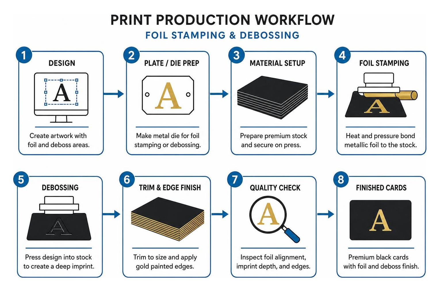
- Traditional Hot Foil Stamping: A custom metal die uses heat and pressure to bond genuine metallic foil leaf onto the paper fibers. This produces a timeless finish with a subtle, natural indent.
- Raised Digital Foil: An innovative process applying UV-curable polymer beneath the metallic leaf, creating a domed, three-dimensional tactile effect without requiring traditional metal dies. You can explore these tactile dimensions in our guide to 3D business cards.
- Metallic Silkscreen Inks: Delivers smooth, opaque gold pigment across larger surface areas, offering a muted sheen that complements bright reflective foils.
- Blind Debossing: Often paired with gold foil, debossing presses un-inked typography deep into heavy cardstocks, creating elegant shadows across matte backgrounds.
Designing and Modernizing Dark Aesthetic Cards
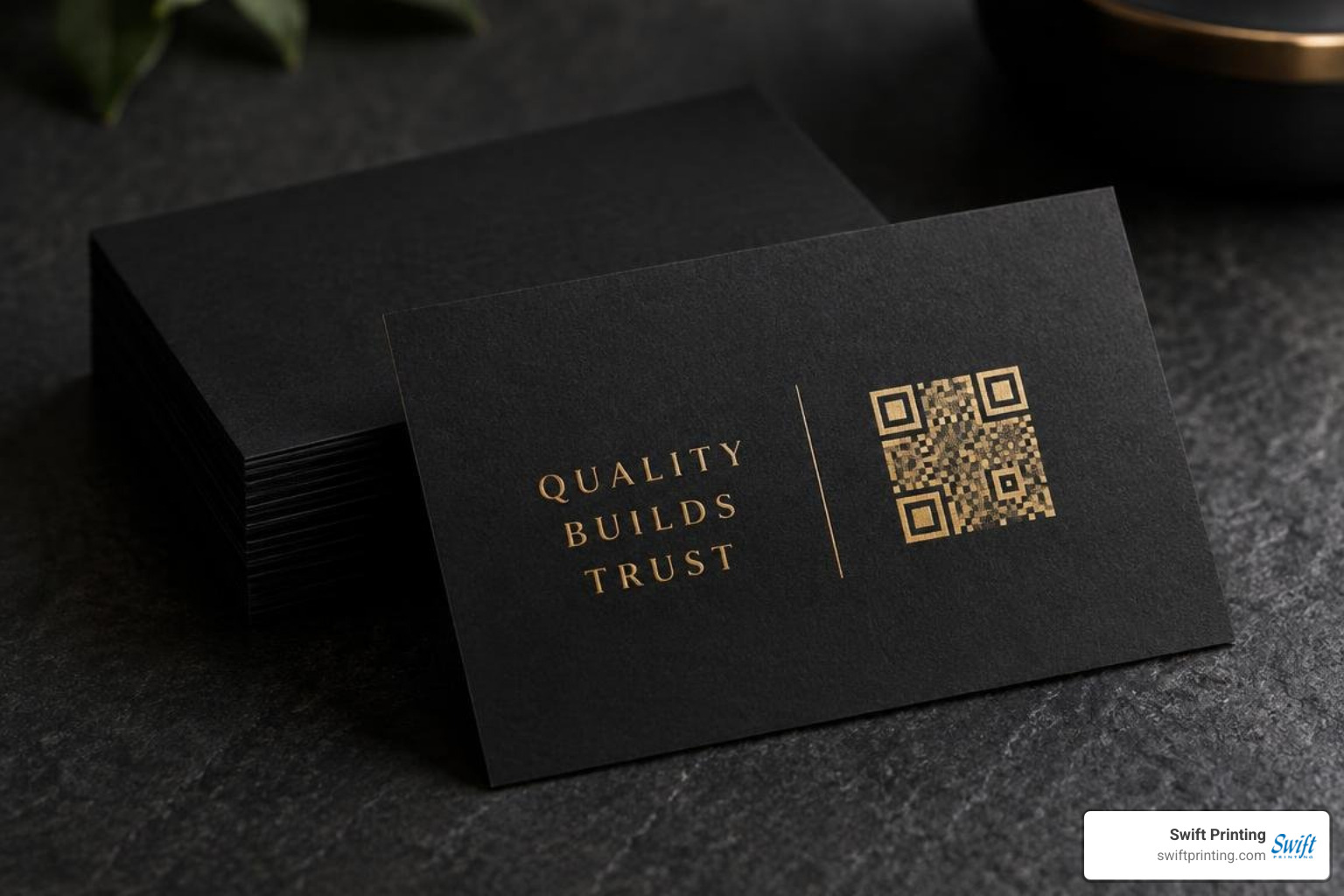
A dark palette requires careful design choices. Without sufficient negative space and precise typography, deep color schemes can feel crowded. Adopting creative visiting card guide strategies ensures your card remains sharp, legible, and balanced.
Minimalist Layouts, Typography, and Contrast Guidelines
When designing dark stationery, simplicity is your greatest asset. Keep these practical layout rules in mind:
- Protect Your Negative Space: Allow generous margins around logos and contact details. Crowding dark cardstock quickly overwhelms the viewer's eye.
- Font Weights Matter: Fine serifs and ultra-thin script weights can fill in or break during production. Use medium-weight serifs or clean, modern sans-serif fonts to ensure crisp edges.
- Avoid Pure RGB Screen Assumptions: Digital screens present deep blacks with radiant backlighting. Physical prints absorb ambient light, making high-contrast vector assets essential.
- Embrace Cultural Precision: Fine typography and intentional layouts have long defined corporate prestige, evoking the clean precision celebrated in the iconic American Psycho printing business card scene.
Modern Features: Smart QR Codes and Metal Construction
You can effortlessly unite classic aesthetics with modern connectivity by integrating interactive digital components and durable substrates.
When integrating scannable links, learn how to implement business cards with QR barcodes to ensure smart devices read your digital landing pages instantly. For an even more indestructible presentation, read our metal business cards QR guide to see how precision laser engraving permanently etches digital codes onto black anodized aluminum.
Frequently Asked Questions About Dark Luxury Business Cards
How do I ensure text readability on dark cardstock?
To maintain sharp legibility on dark paperboards:
- Use true vector files (such as PDF, AI, or EPS) to prevent blurred raster edges.
- Set body copy sizes to at least 8pt, avoiding hairline font variations.
- Choose opaque foils or screen-printed white and metallic inks rather than standard semi-translucent CMYK inks, which can fade into dark paper fibers.
- Ensure adequate kerning (letter-spacing) so adjacent letters remain clean and distinct.
What is the mechanical difference between traditional foil stamping and metallic ink?
Traditional foil stamping applies an impenetrable, mirror-finish metallic leaf via heated metal dies, resulting in complete opacity and a crisp, light-catching reflection. Metallic ink suspends fine bronze, copper, or aluminum flakes in a liquid carrier; it prints like standard ink, yielding a softer shimmer rather than a high-sheen mirror effect. When preparing your order, reviewing how many business cards to order can help you select the ideal production run for custom die setups.
Can QR codes be scanned reliably on dark or metallic backgrounds?
Yes, provided you preserve optical contrast. Standard smartphone cameras require a light-to-dark contrast ratio to detect data points:
- Inverted Codes: Ensure the light elements of the matrix contrast cleanly with the dark substrate.
- Dedicated Quiet Zones: Maintain an unprinted, light matte margin around the perimeter of the code box.
- Avoid Ultra-Gloss Surfaces: High-gloss metallic fills directly over the matrix modules can create camera glare that interferes with scanning.
For step-by-step technical layout tips, review our dedicated QR code business cards guide.
Elevating Your Brand Aesthetic with Swift Printing
Your business card represents your professional standards before, during, and long after an introductory meeting. Achieving the right harmony of deep charcoal textures, warm foil accents, and clean typography requires seasoned craftspeople who understand paper science and mechanical finishing.
At Swift Printing, we are a high-end print shop setting the standard for boutique business printing. Whether you are leading a firm in Grand Rapids or directing corporate initiatives across West Michigan, Rockford, Ada, Belmont, Kalamazoo, or Lansing, our master press team provides personalized guidance, tangible material proofs, and meticulous quality control on every run.
Contact our team today to explore material swatches and discover how our custom business cards in West Michigan can bring your executive brand aesthetic to life.