How to Design Creative Business Cards That Get Remembered
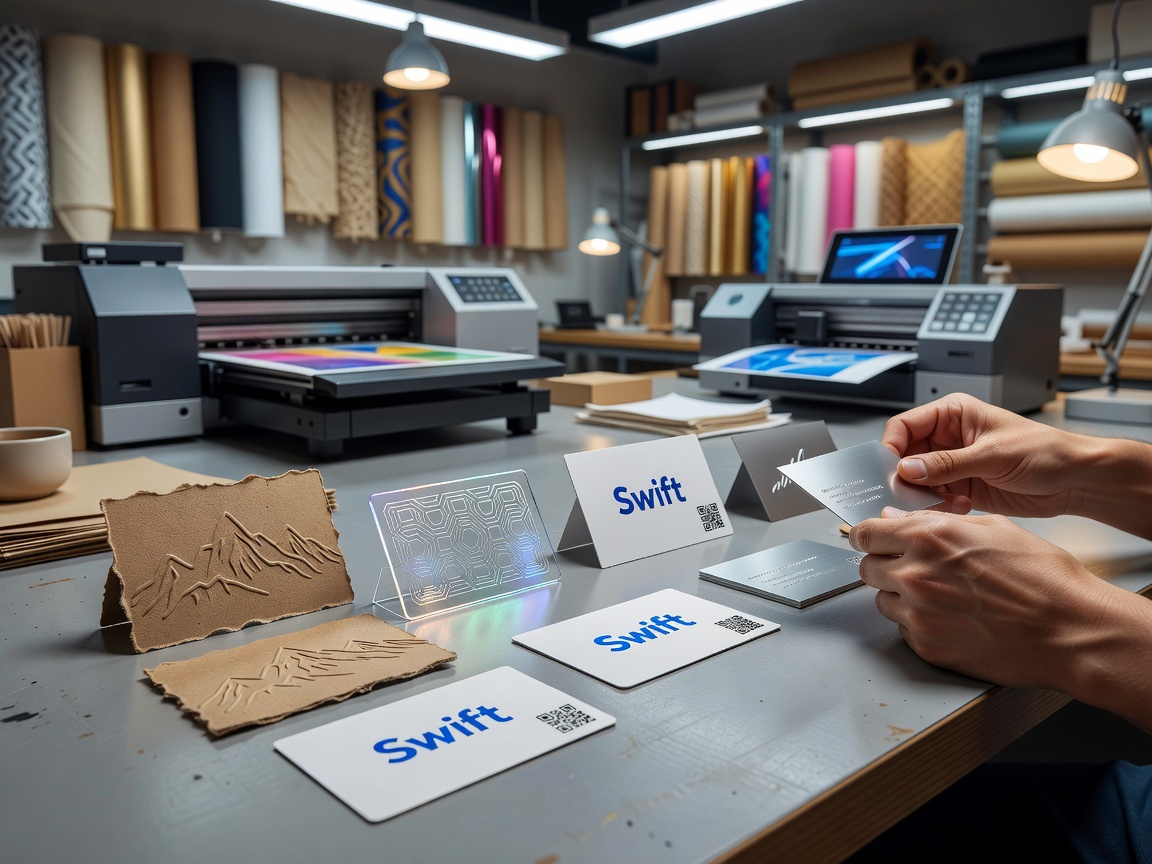
We've all felt the weight of digital fatigue. After years of virtual handshakes, endless Zoom calls, and thousands of unread emails, physical interactions feel refreshing again. As in-person events and conferences continue to dominate our schedules in 2026, the humble business card has reclaimed its spot as an essential networking tool.
Handing someone a card creates a physical touchpoint that bridges the digital gap. When you meet someone face-to-face, a tangible card anchors that conversation in memory. Research into tactile engagement shows that physical objects stimulate emotional processing and spatial memory far more effectively than a digital contact transfer. In short: people remember physical cards because they can touch and hold them.
A card also speaks volumes about your brand's credibility. Handing over a thoughtfully crafted piece of stationery communicates that you take your work seriously. It demonstrates attention to detail before you've even delivered your pitch. As we discuss in our look at why you still need business cards in a digital age, print isn't a replacement for digital channels — it's the personal anchor that makes your digital presence feel authentic and established. print is not dead; it has evolved into a high-touch luxury medium.
Balancing Creativity and Professional Readability
When designing creative business cards, it is easy to let artistic enthusiasm overshadow function. A card can feature extraordinary metallic foils and custom textures, but if the recipient cannot read your phone number or email address, the card fails its core job.
Achieving the perfect balance requires a clear visual hierarchy:
- Primary Anchor: Make your name or main visual element stand out immediately using scale, weight, or contrasting layout positions.
- Orientation: Experimenting with vertical layouts offers an instantly fresh feel compared to standard horizontal cards, while still fitting neatly into cardholders.
- Typography: Choose crisp, legible typefaces for your secondary details (email, phone, web address). Avoid overly decorative script fonts for tiny body copy. Keep font sizes strictly at or above 7pt to ensure legibility across all lighting conditions.
- Brand Identity: Your choice of brand colors, primary logos, and core messaging must instantly connect to your website, social presence, and physical storefronts.
Essential Techniques for Creative Business Cards
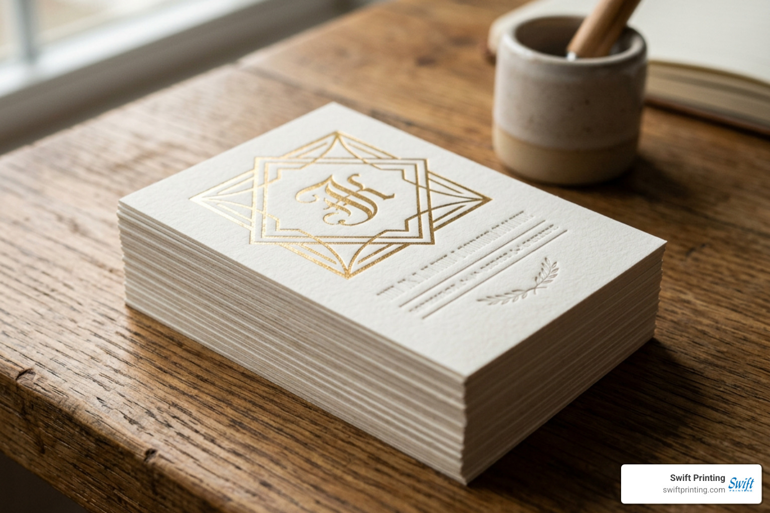
Creating a memorable card goes far beyond what happens on a computer screen. The physical materials you select play just as big a role as your design layout. Choosing heavy cover weights — such as 16pt, 18pt, or ultra-thick 32pt stocks — gives your card an immediate sense of substance. For a deep dive into how paper choices impact print, explore our guide on crafting the perfect business card behind the print.
High-Impact Printing Techniques: Foil, Letterpress, and Duplexing
To transform a flat piece of paper into an engaging brand asset, consider utilizing specialized print finishes:
- Foil Stamping: Applying metallic (like gold, bronze, or silver) or reflective hot foils creates light-reactive depth. It draws the eye instantly to key logos or wordmarks.
- Letterpress Printing: Debossing letters deep into thick, soft paper stock (like 100% cotton) creates a rich tactile impression that recipients instantly notice with their fingertips.
- Duplexing: Duplexing is the art of gluing two separate paper stocks together to create a double-thick card, often featuring contrasting colors on the front and back.
A prime real-world example of these techniques working together is showcased in Calvin Brue's 'Marbelous' business card. The production run of 500 cards cost approximately $600 and featured gold foil stamping applied over a custom 100 lb. cover stock duplexed to hand-marbled paper. Because marbled paper patterns are organic and non-repeating, every single card produced in the run became a completely unique piece of artwork.
Tactile Textures and Specialty Finishes
Texture prompts immediate sensory engagement. When a business card feels unique, people hold onto it longer.
- Cotton Paper: Naturally soft and thick, cotton stock delivers an organic, high-end feel perfect for artisan brands and luxury services.
- Clear-Foil Debossing & Spot UV: Adding a subtle, glossy clear foil or raised spot UV over matte paper creates visual depth without adding contrasting color.
- Gilded Edges: Painting or foil-stamping the outer edges of thick cards adds a hidden flash of color or shine when stacked or pulled from a pocket.
- Velvety Soft-Touch Matte: Soft-touch laminates give standard cardstock a smooth, suede-like finish that feels incredible to hold.
Tailoring Design Approaches Across Different Industries
Every industry has a distinct visual language, and your business card design should reflect your specific niche:
- Artistic & Creative: Don't be afraid to break rules. Showcase full-bleed portfolio imagery, bold color palettes, or unique elements like hand-wrapped thread or paint splatters.
- Corporate & Professional Services: Lean into minimalist elegance. High-weight white or deep navy stock paired with subtle blind debossing or gold foil accents conveys authority and trust.
- Hospitality & Retail: Consider interactive designs. A coffee shop or boutique can combine an elegant front-facing business card with a loyalty stamp card grid printed on the back.
Real-World Examples of Innovative Card Designs
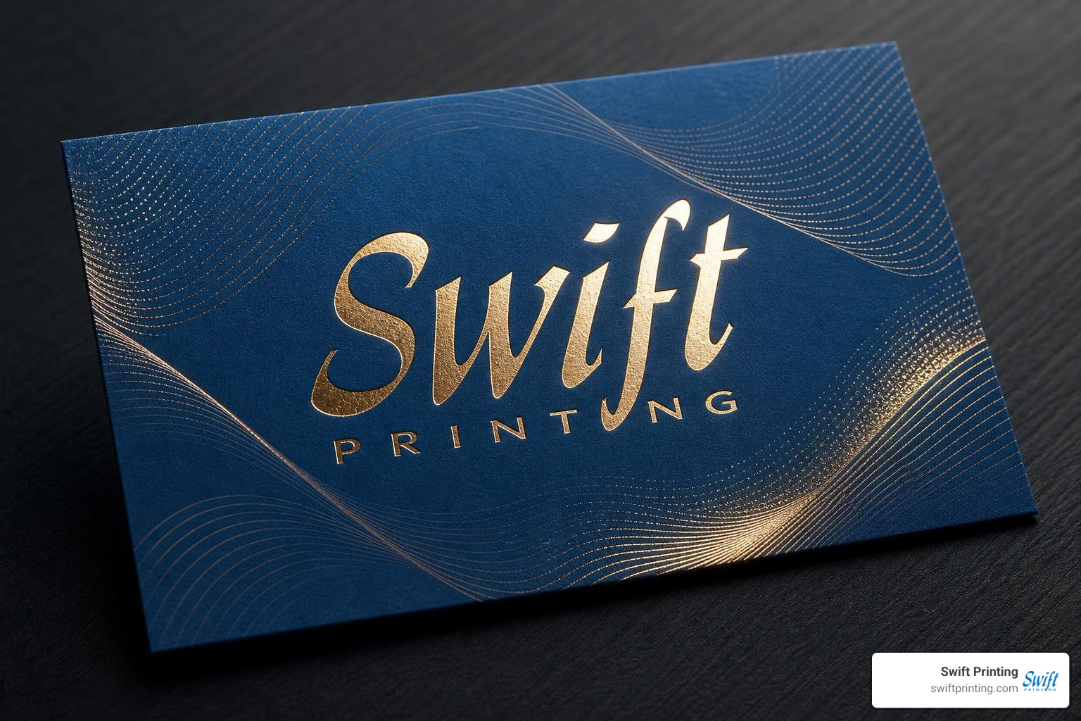
Looking at real-world design innovations demonstrates how top creative studios elevate print items into unforgettable brand stories.
Generative Design and Code-Driven Patterns
One of the most groundbreaking trends in high-end print design is merging digital code with tactile finishing. Design studios are utilizing generative software algorithms — powered by WebGL physics simulations — to create dynamic visual patterns.
A notable project in this space is featured on Patrik Hübner's generative business cards page. Using custom design algorithms, an infinite variety of unique visual patterns are generated automatically. Each card receives its own one-of-a-kind pattern output, which is then pressed onto paper using a light-reflecting, holographic hot foil layer. The resulting print piece serves as a physical metaphor for dynamic, evolving modern brands.
Storytelling Through Minimalist Typography
On the opposite end of the spectrum lies extreme typographical restraint. You don't always need bright colors or complex illustrations to make a statement.
For instance, the project highlighted on Somehow's business cards page showcases minimalist, bilingual letterpress cards. By pairing clean typography with a striking philosophical quote on stardust in both English and French, the design relies on quiet sophistication, clean layout composition, and deep letterpress texture to leave a lasting mark.
Common Pitfalls to Avoid in Business Card Design
Even the most creative design concept will fall flat if technical execution errors occur during file preparation.
| Common Pitfall | The Issue | Best Practice Solution |
|---|---|---|
| RGB Color Mode | Screen colors look dull or shifted when printed | Convert all print artwork files to CMYK color space before export |
| Low Image Resolution | Images look blurry, pixelated, or soft | Ensure all artwork and raster assets are set to 300 DPI at full print size |
| Missing Bleed Area | White hairline gaps appear on card edges after cutting | Extend background artwork 0.125 inches beyond the final trim line |
| Text Placed Too Close to Trim | Information gets chopped off during physical trimming | Maintain a 0.125-inch safe zone margin inside the trim edge |
| Over-Designed Layouts | Busy graphics overpower contact information | Maintain high contrast and clean spacing around essential body text |
Preparing Print Files for Creative Business Cards
Professional print preparation ensures your physical cards look identical to what you envisioned on your monitor. Standard US business cards measure 3.5 inches by 2 inches. To properly prepare your files:
- Set Up Bleed Margins: Always build your print document canvas to 3.75 x 2.25 inches. This includes the required 0.125-inch bleed around all four edges.
- Respect the Safe Zone: Keep all text and essential logos at least 0.125 inches inside the final 3.5 x 2 inch trim line.
Understanding why crop and bleed marks matter in commercial printing prevents costly re-runs. To avoid headaches, take time to review the 10 most common print file mistakes and how to avoid them. If you're sourcing design templates — like those found on Creative Market's business card templates — make sure the original files are fully editable vector layers set to 300 DPI in CMYK mode.
Avoiding Over-Designed Creative Business Cards
It is easy to get carried away trying to fit every idea onto a 3.5 x 2 inch piece of paper. Avoid these common design traps:
- Cluttered Layouts: White space is your friend. Give your logo and contact details room to breathe.
- Low-Contrast Colors: Light grey text on a white background or dark blue text on black stock makes contact details unreadable.
- Decorative Font Fatigue: Using three or four different decorative display fonts creates visual chaos. Stick to one bold headline font and a clean sans-serif for contact details.
Frequently Asked Questions About Business Card Design
What are the standard dimensions for custom business cards?
In the United States, the standard business card dimension is 3.5 inches wide by 2 inches tall (horizontal orientation) or 2 inches wide by 3.5 inches tall (vertical orientation). When preparing artwork files for press, add a 0.125-inch bleed to all sides, making your overall design layout file 3.75 x 2.25 inches.
How do materials and finishes impact business card production costs?
Basic digitally printed cards on standard 14pt or 16pt cardstock are very affordable. Adding specialty techniques — such as multi-layer duplexing, custom die-cutting, metallic foil stamping setups, or heavy cotton letterpress runs — increases production costs due to custom tooling and manual press labor. However, for key client meetings and networking, the return on investment from a premium card far outweighs the initial print cost.
How can I ensure my business card matches my brand identity?
Build your card directly from your brand toolkit. Use your exact brand CMYK color codes, official primary vector logos, and designated brand typography styles. Consistency across your physical cards, product packaging, and digital channels builds long-term customer trust and instant brand recognition.
Conclusion
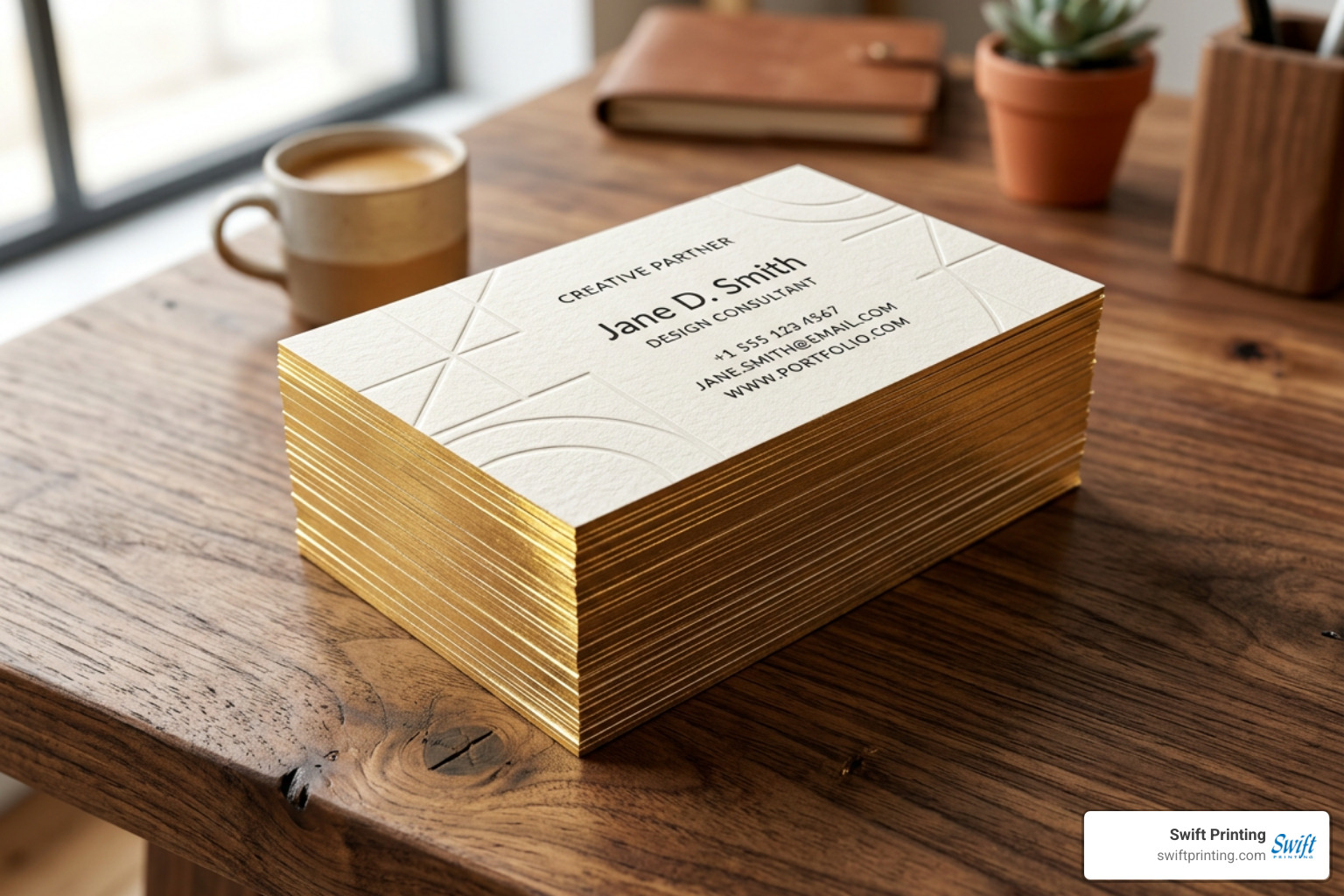
In a world filled with ephemeral digital noise, creative business cards remain an irreplaceable physical touchpoint. By pairing thoughtful graphic design with tactile paper stocks, rich foil finishes, or unique letterpress impressions, you create an anchor for face-to-face connections that lasts long after a networking event ends.
At Swift Printing, we bring creative print visions to life right here in Grand Rapids, Michigan. As one of only two Certified B Corporations among commercial printers worldwide, we balance premium craftsmanship with a deep commitment to sustainable practices, our local community, and our environment.
Whether you need guidance on file setup, paper stock selection, or elevated finishes for your next card run, explore our local services for business cards in West Michigan. Let's craft something unforgettable together!