Top Creative Beauty Parlour Visiting Card Ideas for Stylists
Make Your Beauty Parlour Visiting Card Worth Keeping
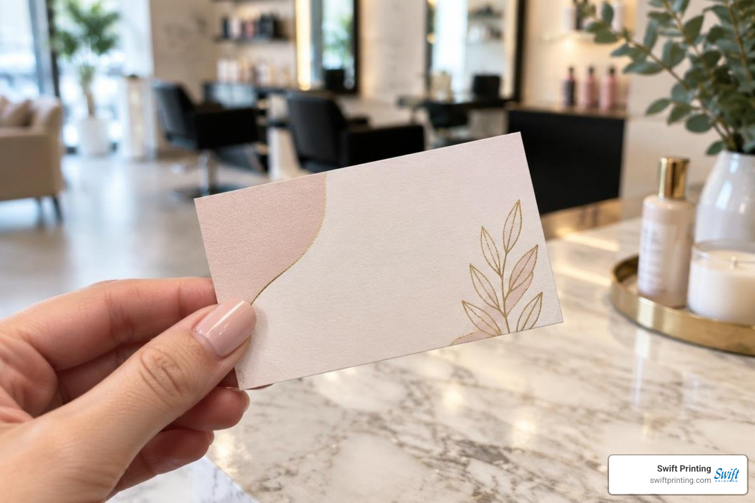
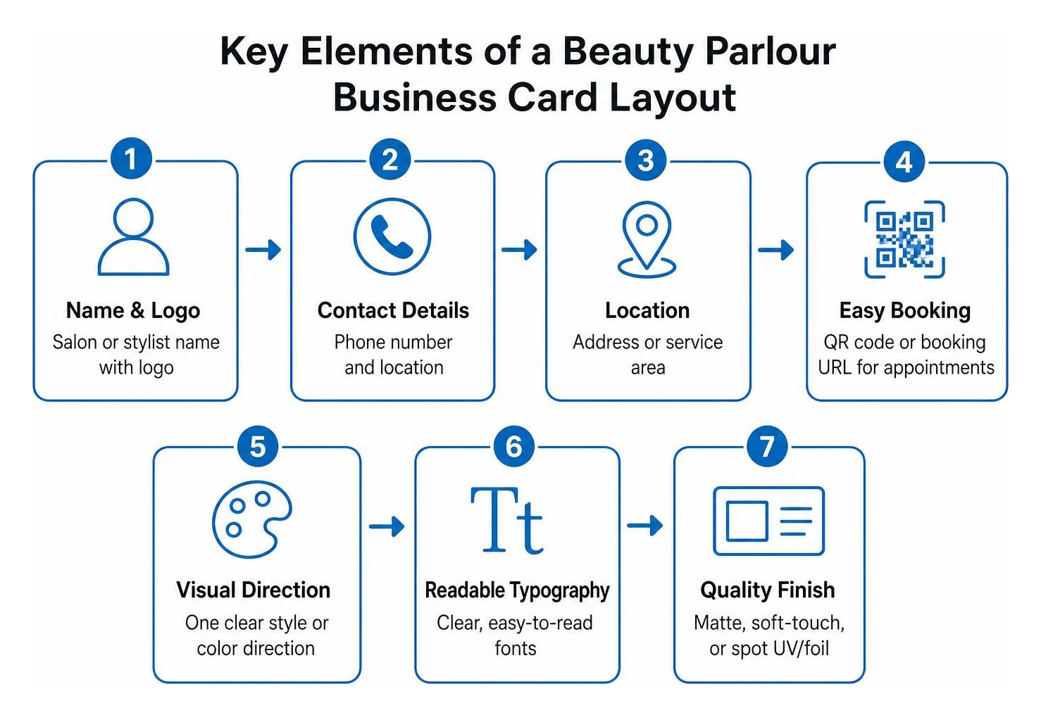
A strong beauty parlour visiting card should do three things fast: show your style, make booking easy, and give clients a reason to keep it. Start with a clean layout that includes:
- Your salon or stylist name, logo, phone number, and location
- A booking URL or QR code that leads directly to appointments
- One clear visual direction, such as minimalist pastels, modern bold color, or luxe foil-accented neutrals
- Readable type, generous white space, and a finish that fits your price point
For most salons, the best card is not the busiest one. It is the one that feels like the experience clients expect when they walk through your door. A matte or soft-touch card can signal calm and premium service, while spot UV or foil can draw attention to a logo without making the design feel crowded.
Your card also works beyond the reception desk. Hand it out after an appointment, add it to welcome kits, leave it with complementary local businesses, or use a QR code to connect clients to your portfolio, reviews, social profiles, and booking page. At Swift, a high end print shop, we help businesses turn those small client touchpoints into polished, reliable marketing pieces.
I’m Jessica Gutowski-Slaydon, President of Swift Printing, and I work with organizations that need practical guidance on paper, finishing, proofing, and deadlines. The ideas ahead will help you create a beauty parlour visiting card that looks professional on screen and feels even better in a client’s hand.
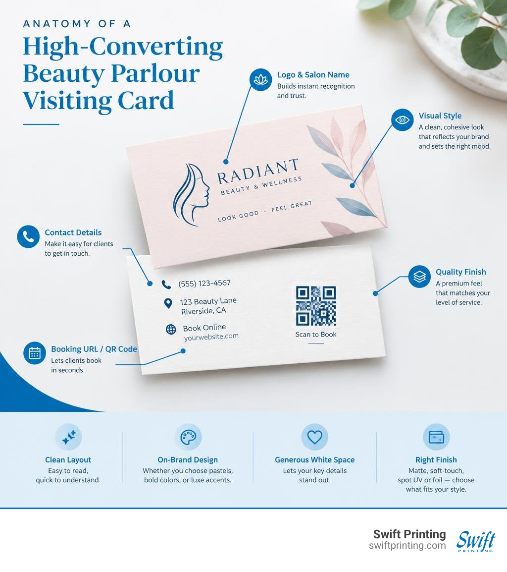
Essential Elements of a Modern Beauty Parlour Visiting Card
When designing an effective card, clarity should always lead the way. A beauty parlour or boutique salon thrives on aesthetic appeal, but if a client cannot read your phone number or find your booking portal within three seconds, the card fails its primary objective. As we explore in our creative visiting card guide 2026, strong print collateral balances striking aesthetics with clean functionality.
Visual hierarchy directs the viewer’s eye through intentional design. Your salon name or primary logo should anchor the top or center of the design, followed by your stylist name, specialty, and contact details. Ample white space—unprinted negative space around text and imagery—prevents visual overload, allowing each element to breathe.
Must-Have Contact Information and Booking Details
Every salon card should clearly present the core information required to turn a prospective client into a confirmed appointment:
- Salon and Stylist Name: Clearly state the parlour's trading name alongside the individual stylist's full name and professional title (e.g., Master Colorist, Bridal Makeup Specialist, Aesthetician).
- Physical Address: Include suite numbers, building names, or distinct landmarks so first-time visitors can easily locate your studio.
- Direct Phone Number & WhatsApp: Ensure numbers are formatted with standard spacing for quick reading.
- Online Booking URL: Provide a short, easy-to-type web link directly to your reservation platform.
- Active Social Handles: Direct clients to your primary visual portfolio, such as Instagram or TikTok, using familiar icon badges.
- Core Service Menu Summary: Rather than listing twenty services, highlight four to five core specialties (e.g., Balayage, Precision Cuts, Lash Extensions, Bridal Packages).
Integrating QR Codes for Instant Appointments
Today's clients expect seamless digital interactions. Incorporating business cards with QR barcodes connects a tangible print piece to your digital reservation system.
When a client scans your custom QR code with their smartphone camera, they can land directly on your real-time booking calendar, dynamic service menu, or gallery of client transformations. This direct access reduces friction, allowing clients to book immediately rather than typing out web addresses. You can also point the code toward Google review pages or seasonal discount promotions, reflecting high contemporary salon aesthetics across every client interaction.
Inspiring Design Concepts and Layout Styles for Stylists
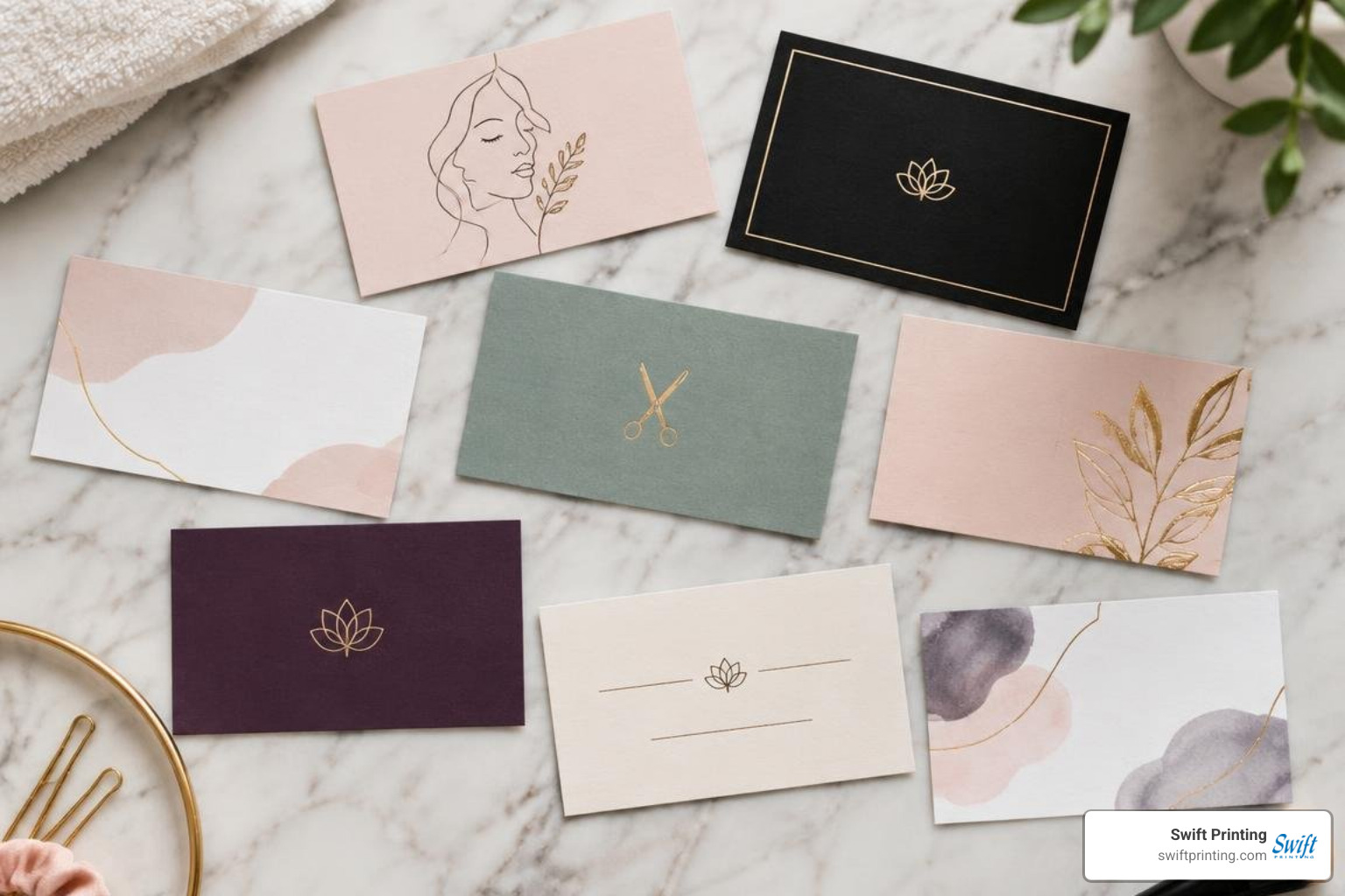
A visiting card acts as an ambassador for your parlour's interior ambiance and design sensibilities. Selecting the right visual style sets client expectations before they sit in your styling chair. For more creative layout inspiration, review our showcase of creative business cards to see how various industries balance typography, color, and finish.
Customizing a Beauty Parlour Visiting Card for Brand Identity
A successful brand identity communicates value through every touchpoint. When personalizing a template or working with a custom designer, keep these design considerations in mind:
- Strategic Logo Placement: Position your primary mark where it commands attention without dominating the entire layout.
- Signature Color Palette: Limit your card to two or three cohesive brand colors that match your studio walls, capes, and digital assets.
- Typography Harmony: Combine a stylish serif or delicate script header with an ultra-clean, legible sans-serif for body copy and contact details. Popular choices like Playfair Display or Cormorant Garamond pair effortlessly with modern geometric sans fonts like Montserrat or Lato.
- Bespoke Botanical Accents: Delicate line-art florals, abstract brush strokes, or geometric framing can elevate visual appeal when used sparingly.
- Client Experience Standards: Aligning physical materials with upscale salon client experience standards builds immediate trust and reinforces premium service pricing.
Vibrant vs. Minimalist Salon Card Aesthetics
Different salon concepts call for distinct aesthetic treatments:
- The Minimalist Aesthetic: Dominated by crisp white, warm cream, or deep charcoal backgrounds paired with subtle typography and generous negative space. This approach communicates sophistication, clean beauty, and clinical precision—ideal for high-end color studios, med-spas, and modern hair lounges.
- The Pastel & Nude Theme: Utilizing soft blush pinks, warm taupes, sage greens, and muted terracotta. These calming hues evoke relaxation, self-care, and wellness, making them a natural fit for day spas, aesthetic clinics, and bridal beauty suites.
- The Bold & Vibrant Style: Featuring high-contrast combinations such as black and gold, deep emerald, rich plum, or electric neon accents. Vibrant palettes project high fashion, avant-garde styling, and creative nail artistry.
Premium Materials, Finishes, and File Specifications
The physical feel of a visiting card makes an immediate statement about your quality standards. Understanding why physical cards remain vital in a digital world comes down to sensory engagement—paper weight, texture, and specialty finishes convey professional excellence before a word is read.
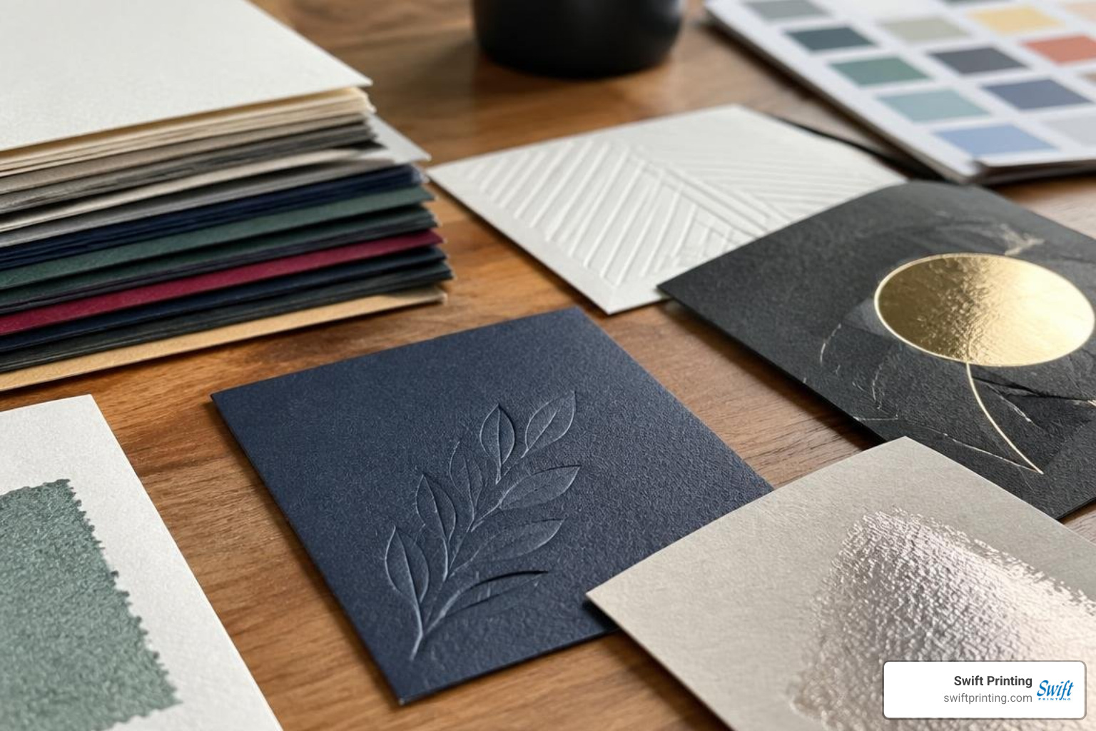
Choosing the Right Beauty Parlour Visiting Card Formats and Print Stocks
High-end commercial printing requires correctly prepared artwork. Whether working in Adobe Illustrator, Photoshop, or CorelDRAW, keep these technical specifications in mind:
- Vector Artwork: Keep logos and typography in vector format (AI, EPS, or vector PDF) to ensure sharp lines at any scale.
- Resolution: Raster images and photos must be at least 300 DPI at final print size.
- Color Profiles: Build all design files using CMYK color profiles rather than RGB to ensure screen colors translate accurately to printed paper.
- Bleed Margins: Always include a 0.125-inch (1/8") bleed allowance beyond the standard 3.5" x 2" trim line to prevent white edges during automated cutting.
- Cardstock Thickness: Select sturdy paper stocks. A minimum of 16pt cardstock (approx. 350 GSM) delivers durability, while ultra-heavy 32pt double-thick stocks provide a commanding, luxurious presence in hand.
High-End Specialty Finishes: Foil Stamping and Spot UV
Specialty finishes elevate standard printing into memorable brand collateral.
| Finish Type | Visual Appearance | Tactile Feel | Best Suited For |
|---|---|---|---|
| Premium Matte | Non-reflective, smooth, low glare | Silky, understated | Minimalist salons, med-spas |
| High Gloss | Shiny, vibrant color depth | Ultra-smooth, slick | Vibrant nail bars, high-energy studios |
| Soft-Touch | Ultra-matte, velvety sheen | Suede-like, soft texture | Luxury boutiques, executive stylists |
| Spot UV | High-gloss clear polymer over matte | Raised, smooth contrast | Highlighting logos, patterns, icons |
| Foil Stamping | Metallic reflection (gold, rose gold) | Crisp, indented sheen | Bridal specialists, luxury parlours |
Best Practices to Avoid Common Salon Card Mistakes
When preparing your files for production, avoiding common pitfalls protects your investment:
- Overcrowding Information: Trying to fit an entire price list onto a 3.5" x 2" card creates visual clutter and tiny, unreadable text. Keep details focused on core contact points.
- Low Contrast Color Pairings: Light gray text on pastel pink backgrounds may look soft on a glowing monitor, but it becomes unreadable in print. Maintain high contrast between text and background.
- Tiny Font Sizes: Never use font sizes below 7pt for critical phone numbers, addresses, or booking links.
- Overlooking Proofreading: A single transposed digit in a phone number or a broken booking URL renders an entire print run unusable. Always review physical or PDF proofs carefully before running the presses.
Frequently Asked Questions About Beauty Parlour Cards
What information is essential on a beauty parlour visiting card?
Your card must display your parlour or brand name, the individual stylist’s name and title, direct telephone contact, full street address, direct online booking URL, active social media handles, and a scannable QR code.
Which paper stock and finish provide the most professional look?
For an upscale, professional impression, heavy 16pt or 18pt cardstock coated with a soft-touch laminate or smooth matte finish is recommended. Adding spot UV gloss or metallic foil stamping to your logo enhances the design with refined tactile contrast.
How can stylists effectively use QR codes on business cards?
Stylists can direct their QR codes to a real-time booking engine, a seasonal promotion landing page, a digital portfolio showcasing recent hair and makeup transformations, or a direct link to submit verified customer reviews.
Conclusion
Your visiting card is more than a slip of paper—it is an enduring physical extension of your salon's brand, artistry, and professional standards. Investing in refined design, durable paper stock, and specialty finishes ensures that every card you hand out reinforces the premium value of your work.
At Swift Printing, we work closely with stylists, aesthetic clinics, and professional businesses throughout Grand Rapids, Rockford, Ada, Belmont, Kalamazoo, Lansing, and across West Michigan. Whether you need expert paper selection advice or precision specialty finishing, we deliver reliable craftsmanship on time, every time. Explore our custom solutions for business cards in West Michigan to create collateral that leaves a lasting impression.